


The first card you see is called a double pocket card. I have 3 different images for you to look at. There is still room to add a sentiment on the front or even on the inside of this card.
 This is what it looks like with the inserts in place on the inside. You could use these as bookmarks or just add whatever personal message you want.
 This image I pulled up one of the inserts for you to see. Like I said, these are fun to make. I really like this card. You could even attach a gift card if you wanted to. The possibilities are endless.
 I used retired SU! DSP delicate dots. Along with is I used certainly celery, so saffron, whisper white, and bashful blue cardstock. I used the extra large flower punch, priceless stamp set, pastel brads, the photo corners punch, and the sizzix simple flower embosslit.
Below is a pocket card. I was not happy with my color choice, but it has kind of grown on me. I am not an orange type of person, I guess. With the DSP I used I could have went with quite a few different color choices for the card base. I try to pay attention to what I have for ribbon colors though. That is what helps me determine which colors to go with.
 Here is an image with the insert pulled out just a little bit for you to see. You could actually add stamped images on it if you want, but I did not.
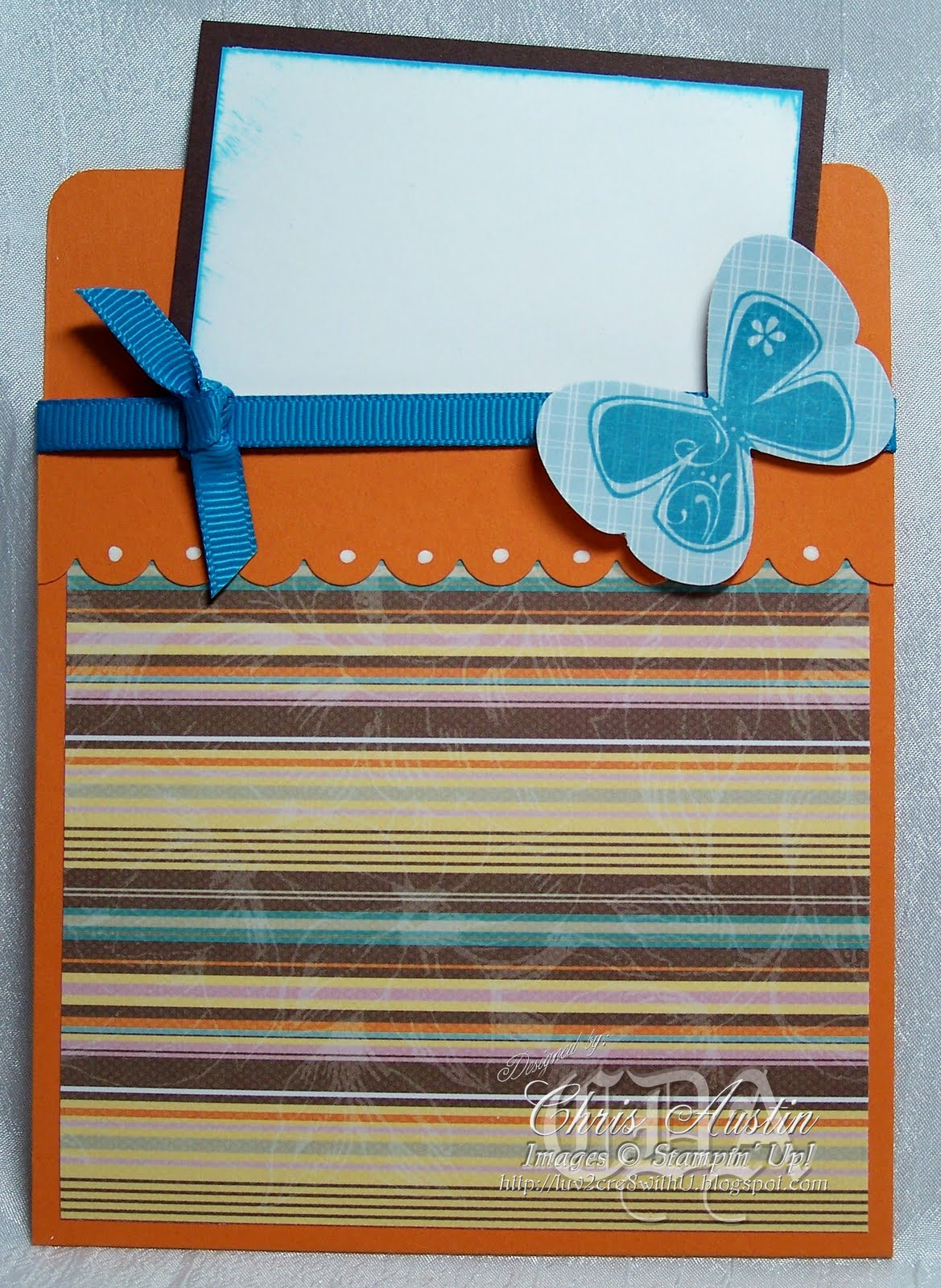 I used pumpkin pie, chocolate chip, whisper white, and the sweet pea designer series paper stack for cardstock. I just bought the butterfly punch recently. I thought it would look good for an embellishment. I also used the scallop edge punch and the priceless stamp set. Lastly, I used tempting turquoise 1/4" grosgrain ribbon.
This card is called a criss cross card. I decided since it had a pocket it could be included in my class. It is really simple to make and works up fast. The first image shows you with the insert out and turned on end.
 The image below is what it looks like when it is ready to go into an envelope. For colors I used rich razzleberry, old olive, whisper white, and cottage wall DSP.
 This last card is called a crimped envelope pocket card. It turned out very pretty. I just wish you could tell in the picture. Once again, the camera didn't do the best.
 Here is a picture of what it looks like with the top pulled off and the insert out of the pocket. I wanted to put a stamped image on it.
 The main part of this card is an envelope. I used pale plum, almost amethyst, and whisper white cardstock. The stamp set is upsy daisy, which makes such beautiful cards. I did also use the frost white shimmer paint on the scalloped image. Shimmer paint is great. I love it.
I hope I have inspired you. Please leave me a comment.
Now go-n-stamp!!


3 comments:
Outstanding project, Chris! These all look so well coordinated and full of variety. Will be CASE-ing this for sure! Thanks for sharing:)
Thank you, Lee! Case away.....I am glad they inspired you. That is what this is all about.
What a great idea for a class! I am sure your customers will love making theses. They are beautiful!
Post a Comment