Tuesday, March 8, 2011

Cards of Elegance

Do you ever look at a card and just think to yourself, "Now, that is elegant?" I don't mean pretty or beautiful, either, I mean "elegant." For my upcoming card class, that is what I was wanting to try and accomplish. Cards with elegance!
The layered example below was really the second card I had made. I was not sure at first if it was going to have the elegant look about it, but in the end, I believe, that it does fit into that category. I believe it took adding some rhinestones and dimension to give it the look of elegance I was looking for. I would love to hear if you think it is elegant or not. I will not be offended if you don't agree.
This is a close up of the dimension that is on the card pictured below. This was also the first card I had made for my class. I thought right away that this was definitely an elegant card. The stamp set "vintage vogue" is such a great set to get the look of elegance.

Of course, I had to show you the total picture of what the card looked like. I did end up changing two things on the card though. At first, the saying "thank you" was in an oval shape. I didn't think it looked right. The other thing I changed was adding the design to the saying. The original I only had the saying, which left it white and boring, in my opinion.

I have two more cards to come up with yet to be finished with my elegance class. Pray I can figure them out. I do have a couple of ideas in my head, but I need to make them into reality.
Thanks for looking. If you have any questions about these cards feel free to ask by leaving it in a comment. Also, tell me what you think of these.
Now go-n-stamp!!

Wednesday, March 2, 2011

Two Step Owl Birthday

My husband turned 50 the 19th of February. I have already decided when it is my turn I am not going to like it. Something about that number makes me think "OLD." Enough said about that though. On to what I am posting. My husband likes owls. I wanted to somehow incorporate an owl into his card. I finally came up with the idea of making it look like it is holding a happy birthday sign with its feet. I picked the colors from the current IB & C catalog. I do that sometimes when I can't figure out colors to use.
This first picture shows the layers of the card. Most of the time when you take a picture facing right at it you can't see the layers. This is why I took this view and posted it on here.

When I was totally finished with this card, I was pleased with the end results. Believe it or not, I am not always totally pleased with what I make. I am sure some of you feel the same way when you make something too.

Stampin' Up! supplies used to create this card are below.
Cardstock: pumpkin pie, marina mist rich razzleberry, wild wasabi, and whisper white
Classic Ink: rich razzleberry and pumpkin pie
Stamp set: punch bunch (sal-a-bration catalog)
Tools: big shot, build a cupcake punch, 2 step owl punch, two step bird punch (branches), scallop square punch, perfect polka dots embossing folder, mat pack and paper piercing tool, and stampin' sponge
Accessories: brights brads and 1/4" whisper white grosgrain ribbon

If this has inspired you to pull out your tools and make are card, please leave me a comment and tell me. Thanks for looking and have a great day!

Now go-n-stamp!!

Monday, February 21, 2011

Late Valentine Card

Ok, ok. I know that Valentine's Day is over and I am late posting this card. None the less, I still wanted to post it on my blog anyhow. I guess, better late than never.
When starting this card I was going to make it the normal 4 1/4" by 5 1/2", but the "LOVE" I was wanting to use was too long to use on a card that size. Due to that reason, I had to change it to a 4 1/4" by 9 3/8" card, instead. It is nice making a different sized card every once in a while.
I even debated on the colors to use to make this card. At first, I was thinking along the lines of blues, but then I had already bought the Love Impressions Designer Series Paper and thought I should use it.
What counted in the end was that my husband loved the colors!


There is no stamping of rubber stamps on this card. It was made using punches, rub-ons, designer series paper, classic ink just to go around some of the edges of the shapes punched out, and a white gel pen.
Even though Valentine's Day is over, I hope you still enjoy seeing this card. Please take a minute a leave a comment.
Now go-n-stamp!!

Monday, February 14, 2011

Magic on Black Class

Tomorrow, I will find out how well my fellow stampers enjoy learning this technique. I pray it goes well and they love their cards when they are done.

I ended up using a few retired items on this card. The stamp set "Live your Dream" is retired and the so saffron ribbon is also. I did not have enough solid image stamps and that is why I used this stamp set to make this last "Black Magic Technique" card.

I am thrilled that some of you have been inspired by the first 3 cards I have posted to try this technique yourself. I can't wait to see what yours turn out like. They are fun to make.

These are the Stampin' Up! supplies I used.

Cardstock: elegant eggplant, so saffron, basic black, old olive, and cottage wall dsp (retired); Stamps: live your dream; Tools: white gel pen, beautiful wings embosslits die, big shot, 2 3/8" scallop circle punch; Accessories: 5/8" so saffron grosgrain ribbon (retired); Ink: craft white.

Once again, I hope this card will inspire you to try this technique. I do not think you will be disappointed. It is a great class idea too.

Thanks for stopping by my blog and please leave a comment if you would like.

Now go-n-stamp!!

Wednesday, February 9, 2011

Magic on Cardstock Class

When I have seen samples of cards using the Black Magic Technique, I loved it. I changed the name a bit though in my title for the post because I do not like the name of the technique.

Personally, I have always liked black for a background. When I used to take my children to have their pictures taken I was always partial to the poses that had a black background. Nope, I don't care for white backgrounds. Black makes things pop (stand out)!

I have 3 cards finished. I have 1 more started but not finished yet. When I get it done I will post it on here for you to see.


Stampin' Up! Colors I used for this card are basic black, tangerine tango, and whisper white. Stamps: tart n tangy and sincere salutations. Tools: 1 3/4" scallop circle, 1 3/8" circle punch, 1 1/4" circle punch, 1 3/4" x 7/8" oval punch, big shot, elegant lines embossing folder, white gel pen, and stampin' sponge. Accessories: basic pearls.

Stampin' Up! colors I used to make this card are regal rose, rose red, basic black, and naturals white. Stamps: thoughts and prayers. Tools: scallop trim border punch and stampin' sponge. Accessories: 1/4" black grosgrain ribbon.

Stampin' Up! colors I used for this last card were rich razzleberry, basic black, whisper white, and regal rose. Stamps: upsy daisy and sincere salutations. Tools: eyelet border punch, ticket corner punch, scallop oval xl punch, 1 3/4" x 7/8" oval punch, an white gel pen. Accessories: 5/8" organza ribbon and basic pearls.
I think these cards turn out beautiful! I know that I am partial though. Thanks for stopping by and leave a comment!

Now go-n-stamp!!

Sunday, February 6, 2011

All in the Folds

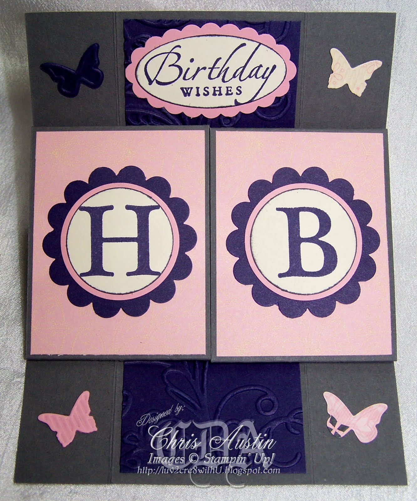
Have you ever looked at a card and knew right away that you want to try and make one too? That is exactly how I felt when I seen this card in the Stampin' Success Magazine (February 2011). It is not an exact duplicate of the one in the magazine, but it folds like it.

This card is very neat. It continuously unfolds over and over always returning to where you originally started. My daughter's birthday was coming up. I thought this would be neat to make for her. I waited to post it on here until she got it and seen it for herself. She and her husband both thought it was pretty neat.

The fun thing about the card is that it looks like it is very complicated to make. Guess what? It really isn't. The main thing is that your cuts have to be precise.


These are Stampin' Up! supplies I used to make this card.
Cardstock: basic gray, pretty in pink, concord crush, pink pirouette, very vanilla, and lap of luxury dsp
Ink: basic gray, concord crush
Stamp sets: sincere salutations and defining alphabet
Tools: build a cupcake punch, big shot, elegant lines embossing folder, backgrounds 1 texturz plates, dotted scallop ribbon border punch, beautiful wings embosslits die, swirls scribbles sizzlits die, scallop oval xl punch, 1 3/4" x 7/8" oval punch, 1/2" circle punch, 1 3/4" scallop circle punch, 1 1/4" circle punch, and 1 3/4" circle punch.
Thanks for taking the time to visit my blog. You can always leave a comment!
Now go-n-stamp!!

Tuesday, February 1, 2011

Valentine Take a Spin

I saved this card for last. The reason is because it is for Valentine's Day. I wanted to post it when it was closer to the occasion.

I could probably have added more details to the top part of the card, but I did not like how it looked when I was playing with it. Sometimes simple looks better than busy. Don't you think so?


Stampin' Up! supplies used:
Cardstock: basic gray, real red, basic black, and love impressions dsp; Stamp set: take a spin; Classic Ink: real red; Tools: 2 1/2" circle punch, dotted scallop ribbon border punch, heart to heart XL punch, itty bitty shapes circle punch; Accessories: game spinner hand.

Now it is your turn to stamp. If my work has inspired you please leave a comment and tell me about it. Thanks for stopping by and have a wonderful day!

Now go-n-stamp!!